 Binarynights

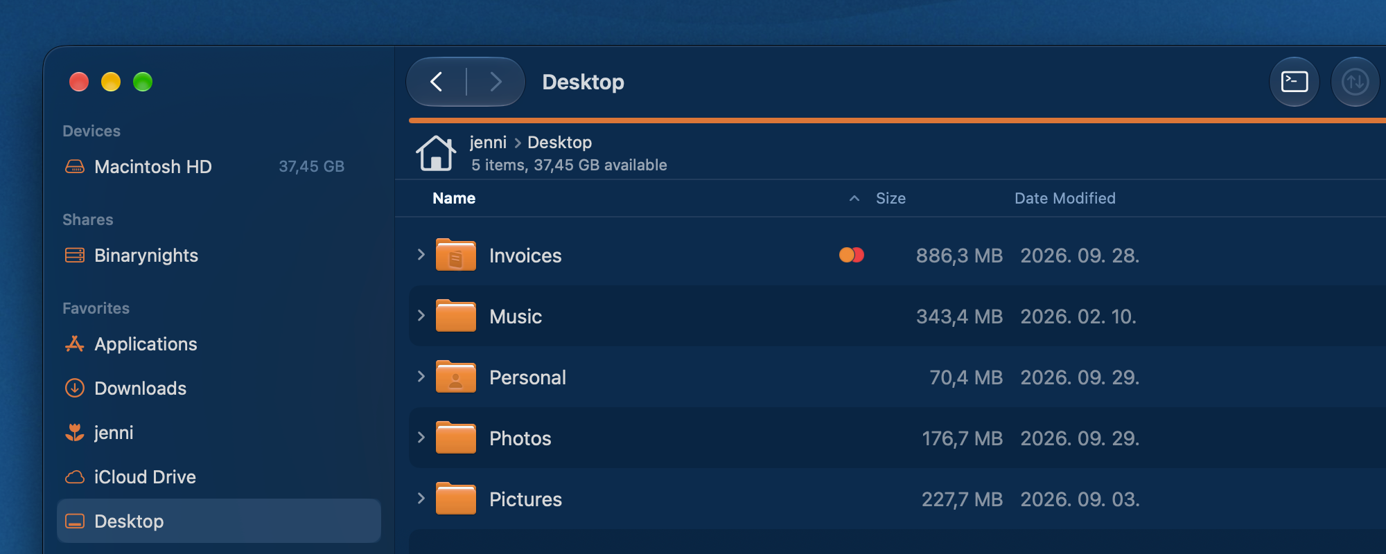
In version 4.7.6, we have mainly focused on improving the user experience when interacting with files inside ForkLift in different ways.
Improvements to Navigation and Path Bars
We have improved the behavior of the path bars at the top of the panes. Because of limited space, long paths can’t be fully displayed, so the individual folder names inside the path get truncated. In extreme cases, that meant that only the name of the last folder was visible, and other parts of the path could not be made visible even when the user hovered the pointer over those parts of the path. This unfortunately also meant that when the user tried to drag items over these collapsed or truncated folders inside the path bar, the folder did not expand to reveal the location, so the user could not be sure which folder they were dragging into. Now, when you hover over a part of the path bar, the folder name below the pointer expands. This also works when you drag files over the path, so you can clearly see which folder you are dragging them into. This makes working with long paths much easier and makes it clearer where you are moving your files.
We also made it possible to move a tab to the other pane from the Window menu. You can use its keyboard shortcut to move the tab very quickly. If you do not like the keyboard combination that we came up with, you can always change it in the ForkLift Settings.
Column View works a little bit differently than the other two views because the selected folder is automatically opened in the next column. In the other two views, you have to open folders to go inside them, which you can do by double-clicking a folder or by using the Go > Open command. Users usually do not select this command from the menu itself, but rather use its keyboard shortcut, Command-Down Arrow. Going one level up to the parent folder is possible with the Go > Enclosing Folder command or with its keyboard shortcut, Command-Up Arrow.
Because of the different behavior in Column View, you do not have to open the folder, and the other way around, in some cases, it was not possible to navigate the entire path backwards to go through all the parent folders using the command or its keyboard shortcut. Now, we have changed the navigation logic, and you can always go back one folder at a time in the path with the Command-Up Arrow shortcut, even in Column View.
Small Details, Better User Experience
Another useful addition in Column View is that double-clicking the column dividers now resizes the column to a size that fits its content. This means you do not have to manually make the column wider just to see the full file names or assigned tags.
We have also made another change to Icon View. The icons are now aligned more consistently within their rows, making the view less busy and giving you a clearer overview of the items. This is a return to the previous behavior, as some recent changes to Icon View had altered the alignment of the items.
One of the very first requests regarding the ForkLift GUI was a rather small change on the surface. When you hover over a tab, the icon in it is replaced by an X that you can click to close the tab. When you hover over the X, a small box appears around it, highlighting the X and visually turning it into a button. This box was darker than the tab color, which made it less visible in the dark theme than in the light theme.
Some users specifically wanted to see a lighter outline in dark mode, similar to what you can see in Finder or Safari. While this may seem like a very small detail that most users probably do not even consciously notice, it was something that some of you really wanted to see changed.
Interestingly, what looks like a simple visual adjustment turned out to be a little more complicated to implement than we expected. But after some work, we managed to make the change, and the close button now has the lighter outline in the dark theme as well.
macOS 27 Golden Gate and SFTP Improvements
We have also fixed two issues that only occur on the upcoming macOS 27 Golden Gate. When you restarted ForkLift on Golden Gate, its sidebar became a little wider each time, which could eventually make it unnecessarily large. This is now fixed. A more important issue affected Column View, where it was not possible to drag an item from a remote location out of ForkLift, for example to the Desktop or into another application. This has also been fixed, and you can now drag items out of ForkLift in all three views on the newest version of macOS.
This update also addresses a compatibility issue with some SFTP servers.
Full List of changes:
New
- Option to move tabs to the other pane from the Windows menu
- Double-clicking the divider between columns in Column View expands the column to the ideal width needed to display its content
Improvements
- Improved pathbar behavior: truncated folder names in long paths are expanded when hovered over or dragged over
- Changed the color of the box around the X button for closing a tab when hovered over, improving visibility and matching the native macOS behavior
- Improved navigation in Column View when using the Go > Enclosing Folder command
- Improved horizontal alignment of icons in Icon View
Fixes
- Fixes the Applications icon in tabs and the Quick Open pop-up window
- Fixes an issue on macOS 27 Golden Gate in Column View where dragging items from a remote location out of ForkLift did not work
- Fixes an issue in the Multi-Rename Window where long labels were truncated in some languages
- Fixes an issue in the Activities pop-up where the activity title was sometimes truncated during synchronization
- Fixes some compatibility issues with SFTP servers
- Fixes an issue on macOS 27 Golden Gate where the sidebar became wider after every restart
I am experiencing an issue with ForkLift 4.7.6 on macOS 27. Application icons are no longer showing up in the submenus (e.g., in the “Open With” menu or other contextual submenus).
I have already tried downgrading to ForkLift 4.7.5 and clearing the application defaults via Terminal, but the issue persists. It seems to be related to the new menu rendering behavior introduced in macOS 27, where submenu icons are suppressed by default at the system level.
Could you please look into this for the next update? The issue can likely be resolved by explicitly setting the preferredImageVisibility property to force icon rendering on the menu items under the macOS 27 SDK.
Thank you for your time and for maintaining such a great app!
Thank you for reporting this problem, we will look into it.
We have fixed this issue. The new version should contain all the icons that are missing now (in some other menus as well).
Duplicate SMB hosts in Sidebar when two network interfaces are active
ForkLift 4.7.6 (485) on macOS 27.0 shows duplicate SMB hosts in the Shares section of the Sidebar when two network interfaces are active.
In my case, both nas and ux appear twice.
dns-sd -B _smb._tcp shows the same SMB services on two interfaces:
nas on interface 7
ux on interface 7
nas on interface 15
ux on interface 15
Interface mapping:
7 = en0
15 = en1
If I disable one of the network interfaces, dns-sd shows only one instance of each SMB host, and the duplicates disappear from ForkLift.
Another interesting detail: in Sidebar Editor, the duplicate entries are linked together. If I hide or show one nas, both nas entries are hidden/shown. The same happens with ux.
This suggests ForkLift is displaying the same Bonjour/SMB-discovered host once per active network interface instead of deduplicating it.
Mounted SMB shares such as books, exchange, home, lacie, and data are displayed correctly and are not duplicated.
Expected behavior: ForkLift should show each SMB host only once in the Sidebar, even if the same service is discovered through multiple active network interfaces.
Please let me know if you need logs or any additional diagnostics.
Thank you for reporting this. We will look into this issue.
I have version 4.7.5 and I am happy with it. I do not intend to purchase a new version or get a new licence.
However, every time I open the app now, a message pops up “suggesting” that I get a new licence. I have said “Skip”, but it keeps coming back.
Is this hobbleware now?
ForkLift checks once every day if there is a new version available if you have enabled that option in the settings. You should turn automatic checks off if you don’t want to see that window. You can do that under ForkLift > Settings > General > Check for updates automatically
a simple feature request: can the forklift ask for the username when connecting to the saved sftp/ftp/other bookmark that doesnt have the username filled inside?
When there is no username, the connection is treated as an anonymous connection. I think that theoretically, we could ask for a username if the anonymous connection fails, but nobody has requested this before. Why don’t you want to save the username when you create the favorite?
I have multiple user’s for a single connection and instead of adding bookmarks for every one of them I’d like to just type the username before connecting.
Thank you for letting me know. I have added your request to our list.
The path bar fix is very welcome. With deep project folders I often only saw the last folder name, so being able to reveal the truncated segments makes a real difference. Thanks for the quick Golden Gate fixes too.
We are happy to hear that you find that improvement useful. We have just released a new update, which contains even more macOS Golden Gate related fixes and some other interesting new features.